


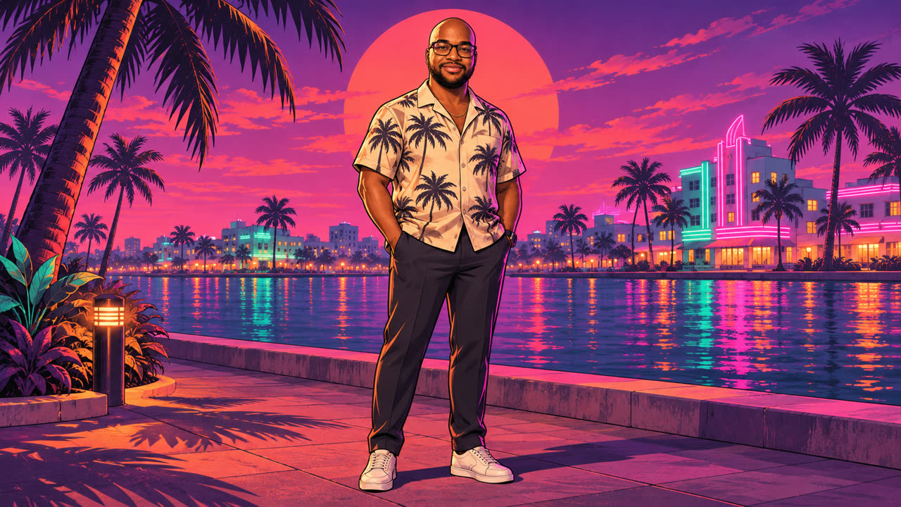
My first GTA was Vice City
The first GTA game I got was Grand Theft Auto: Vice City for the PlayStation 2. There was one problem. I wasn’t allowed to play it.
I’ve grown up since then and become a fan of the series. I don’t own a console at the moment, but getting one is something I’m looking forward to as my business grows. For launch week, I had a different way to join in. I could give my own website a bit of that Vice City feeling.
The original came out in 2002 and earned a 95 Metascore on PlayStation 2. Rockstar’s official site lists 19 November 2026 as the GTA 6 release date for PlayStation 5 and Xbox Series X|S, with the series returning to Vice City in the state of Leonida.
See Vice City’s PS2 reviews on Metacritic and Rockstar’s official GTA 6 launch page.
GTA 6 on Metacritic
Metacritic’s GTA 6 listing brings release details, critic reviews and player ratings together. Its Metascore combines scores from critics, and the user score reflects ratings from players. The pre-launch listing I checked showed both scores as pending. Readers can use the listing to follow how each develops as reviews arrive.
The original Vice City reviews on PS2 give a snapshot of what critics saw in 2002. The GTA 6 launch gallery gives a more immediate sense of Rockstar’s return to the city. For my site, I kept coming back to the way colour tells you where you are. A warm sunset, purple shadows and a few bright signs were enough to suggest the setting before I’d written a line of copy.
What changed in the GTA 6 redesign
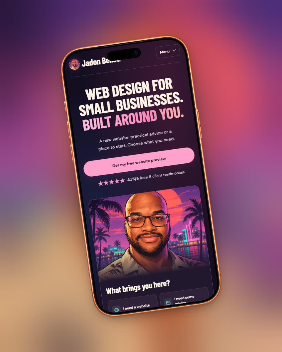
I started with a scene with palm trees, a huge coral sun, purple shadows and the glow of signs after dark. Those colours became the palette for the site. Deep plum carries most of the page, cream keeps long stretches of copy readable, and pink and turquoise pick out buttons, links and small details.
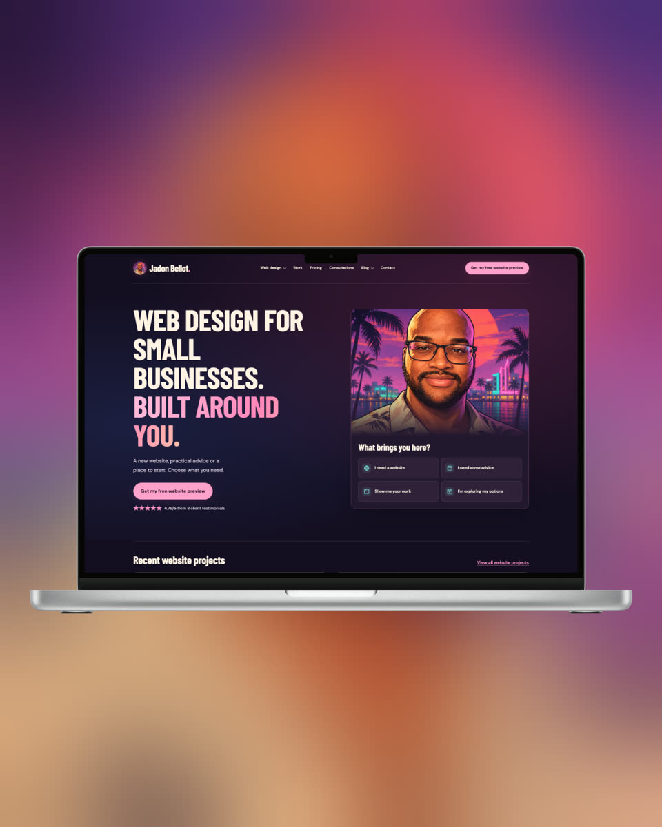
I switched the headings to Barlow Condensed and kept the body copy in DM Sans. The first pass took the size a bit too far. “Small businesses” broke apart on desktop, and the main message took longer to read. Scaling it back gave the words some breathing room and left more space for the portrait and the next action.
Then I used my own headshot as the basis for a character portrait. I kept the glasses and beard, added a tropical shirt, and put myself against a neon waterfront. That same illustration works in the homepage and as a small avatar. The browser tab got a pink JB monogram to match.
The details I had to get right
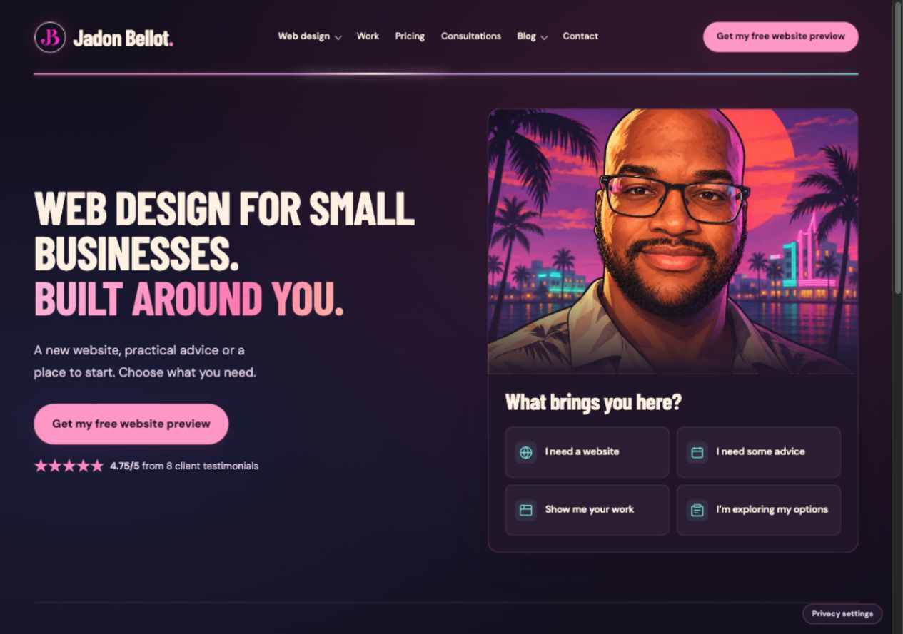
The line beneath the navigation was a good place for a small animation. I replaced it with a pink-to-turquoise bar and added a highlight that travels along it. The colour stays visible as a static gradient for people who prefer reduced motion.
Changing the background revealed how much of the old colour palette was hidden in individual components. Some testimonial cards still had pale backgrounds underneath cream text. On the homepage, “Show me your work” turned blue only when you hovered over it. Those were easy to miss if you stopped at a screenshot of the hero.
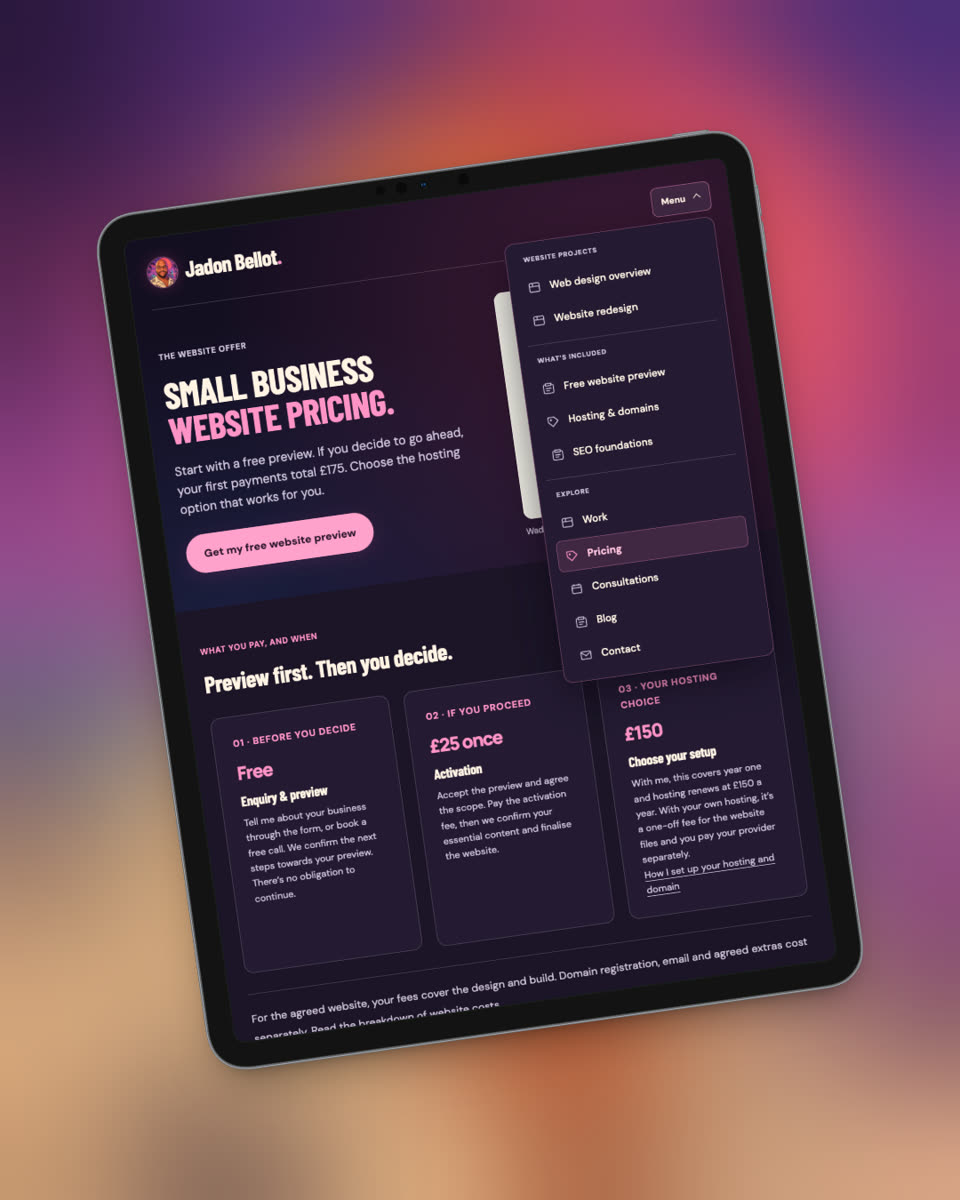
I checked all 55 pages in the themed preview at desktop and phone widths and tested the menus, hover states, tables and booking controls. I darkened the panels where the old colours clashed and checked the four homepage cards one by one. They now keep cream text and turquoise icons on hover.
What I’d take into a small business redesign
Start with a visual reference you can describe in a sentence. I had Vice City at dusk. A café might start with its blue shopfront and handwritten menu, or a photographer might choose the warm tones that run through their favourite work. Pick two or three details people can recognise and use them consistently.
Then test your most important journey on a phone. Can someone understand what you do, find proof and take the next step? My homepage still gives visitors a direct way to get a free preview, ask for advice or see my work. The redesign changes the mood around those choices, so I checked that the choices themselves were still easy to find.
If you’re weighing up changes to your own site, use my small business website redesign checklist to decide what to keep and what to fix. You can also visit my homepage to see how the layout and navigation work.