

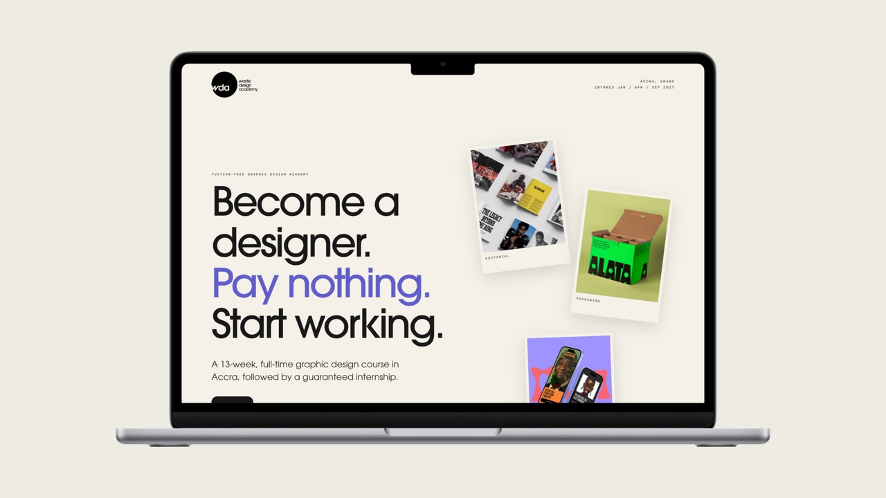
Give people the facts they need to make a decision.
I worked with Leroy Wadie, the academy’s founder and creative director, and Alisha Knight, its executive director. Leroy shared the academy’s copy, brand assets and layout ideas. I used those to build a first preview that we could review together before launch.
The graphics Leroy supplied were a big part of why this project was such a pleasure to deliver. The editorial layouts and packaging on the homepage give prospective students a feel for the academy’s approach to design. I gave the artwork room while keeping the route to applying clear. Good images can make or break a website because they help people understand what you do before they read a word.
On our review call, Alisha pointed out that we were using “course” and “programme” interchangeably. The course is the 13 weeks of full-time graphic design training. The programme includes the course and the guaranteed internship that follows. We carried that distinction through the site so prospective students could see what they were applying for.
Put the course and the application in the same journey.
We changed the main button from “Enrol now” to “Apply now” so the wording matched what visitors were about to do. The homepage also gave people a second route, “Explore the programme”, for anyone who wanted to read about the training and internship before applying.
We replaced a single enquiry form with separate cards for the January, April and September intakes. Each card links to the matching application form. That made the choice of intake clear before anyone started filling in their details. See the academy’s application page.
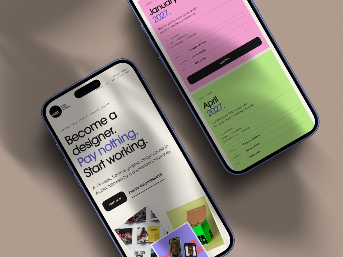
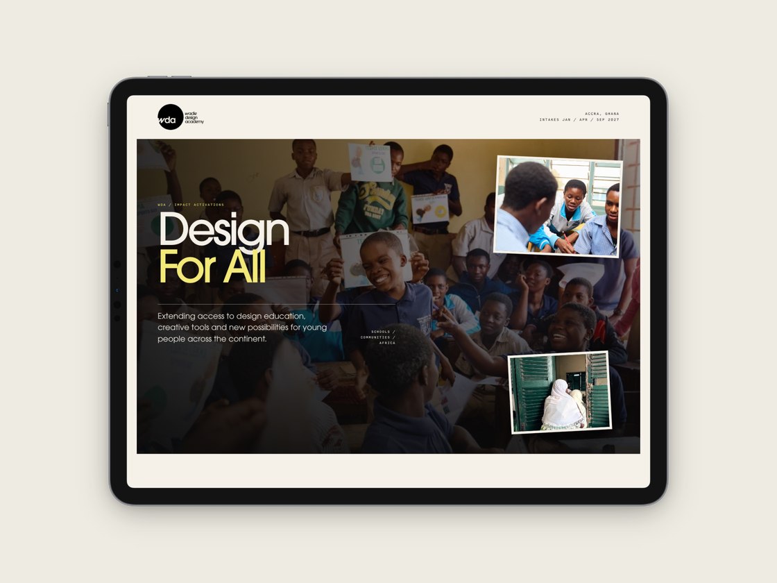
In the final email review, Leroy and Alisha helped tighten the copy and flag repeated sections. I made those edits and refined the imagery and navigation before launch. The Wadie Design Academy case study shows the site across desktop, tablet and mobile.
From first preview to live in 11 days.
The full project took about a month from our first conversation to launch. I sent the first preview on , we reviewed it together the next day, and the site was live by , ahead of the academy’s campaign.
Having the academy’s copy and brand assets gave me a clear starting point. The review call helped us agree what needed to change, and we wrapped up the final edits by email.
On Instagram
What Leroy said about the project.
“The whole process was absolutely professional from communication to the actual project being done. What impressed me the most was you delivered beyond our expectation. Taking a simple brief and turning it into something great.”
Leroy Wadie, Wadie Design Academy
Try the same test on your website.
Pick one social post that sends people to your website. Open the destination on your phone as if you’ve never seen it before. Can you immediately tell you’re in the right place? Can you find the information you need to decide? Is the next step obvious?
If one of those answers is unclear, fix that part first. For a training provider it might mean showing entry requirements closer to the application link. For a service business it might mean linking directly to the service and explaining what happens when someone asks for a quote.
I’m sharing lessons like this through The 100 websites project. If you’re preparing your own site, start with my website preparation checklist.